Consolidating AGCO digital landscape

Introduction
As a global leader in designing, manufacturing and distributing agricultural solutions. Agco is working tirelessly to help make today's farms more productive and more profitable. During it’s long existence Agco aquired many different brands and today they are proud to say that they own 21 brands in various area of agriculture.
Research
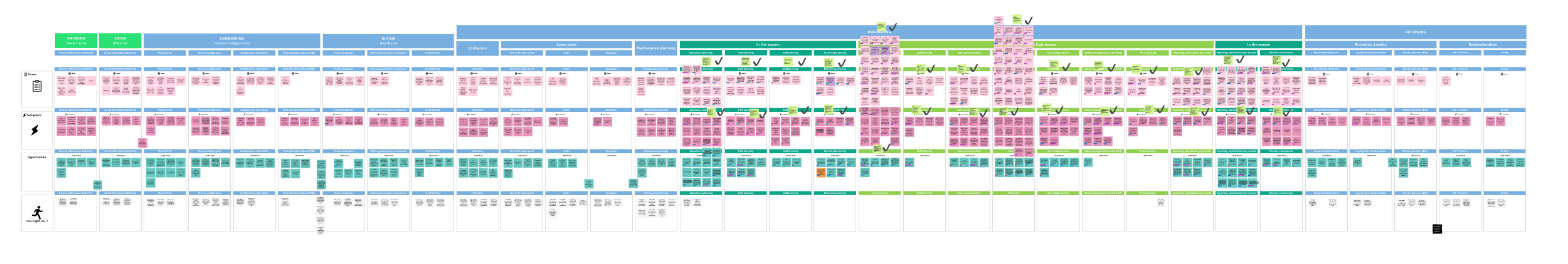
With so many brands came their digital solutions and different user cases and personas. Some users are driving and maintaining machines while others don’t see the field at all and work from the office on seasonal planning and many personas work in task management and other related tasks.
Farmers expected Smart Farming topics to be included in the Fleet & Machine Maintenance Platform
•The Farmers need to know where they can find their equipment on the farm if needed.
•To plan their work accordingly, Farmers need detailed machine configurations and estimated machine usage.
•
•Farmers with mixed fleets need to be able to integrate competitors‘ equipment.
•Farmers do work with a lot of different application for different contexts in order to plan accordingly and need quick accesses to them. E.g. Weather Apps, Fendt One,... (Interview Comments)
•All in One Tool - Participants expected a fully integrated field management (incl. Tasks and list of fields, measurement of work trace) (Observation)
Problem
All of those personas used different branded applications and while it was working for some others were struggling with constant branding change that was happening throughout day-to-day work.
Having in mind the development capacity team understood that there is a need for brand-agnostic first-level navigation and information layout.
Design Process
Phase 1 - Wireframe prototype
I started testing low-fidelity prototypes on different personas so I could understand what information they needed during day-to-day work. We had a few testing phases before we ventured into high-fidelity design.

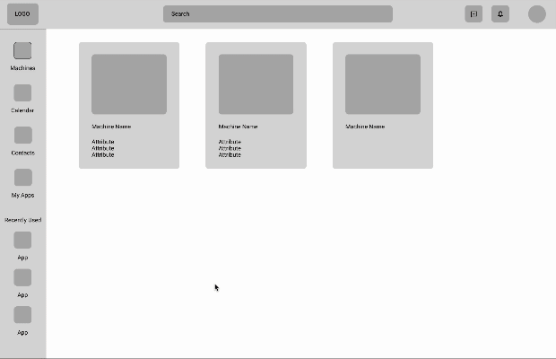

Working on low-fidelity prototypes I tested with stakeholders different navigation approaches and what kind of content is most useful for them to be efficient. When content was determined we proceeded with different approaches to navigation and general layout of the first level
Phase 2 - Mockup prototype
I started testing low-fidelity prototypes on different personas so I could understand what information they needed during day-to-day work. We had a few testing phases before we ventured into high-fidelity design.

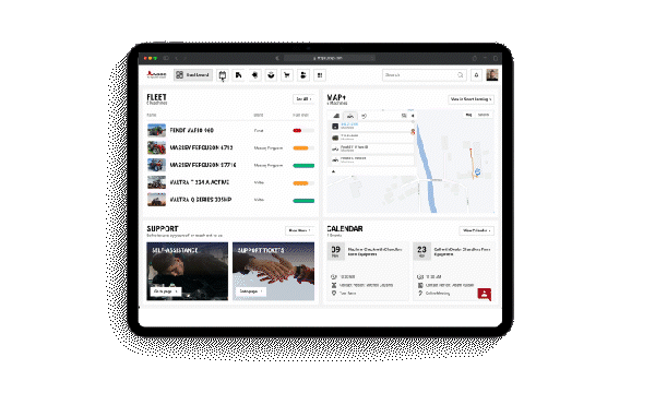
Phase 3 - High fidelity prototype
High-fidelity prototypes are interactive and closely mimic the final product. They incorporate realistic content, detailed visuals, and interactive elements, allowing designers to test functionality and user experience comprehensively. High-fidelity prototypes are crucial for usability testing and obtaining feedback before development begins.

Phase 3 - High fidelity prototype
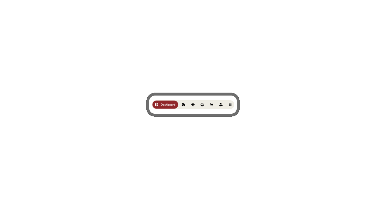
Designing a user interface (UI) that can be used on different devices is crucial in today’s digital environment, where users interact with applications across a wide range of devices including smartphones, tablets, laptops, desktops, and even wearables. This approach, often referred to as responsive or adaptive design, ensures that users have a consistent and functional experience regardless of the device they are using. Here are several key reasons why this is important:
1. Improved User Experience
A well-designed, multi-device UI enhances user experience by ensuring that content is easily accessible and interactable across all devices. Users expect a seamless transition between devices without having to relearn how to use an interface. For example, a user might start reading an article on their phone and continue on their desktop; a consistent UI design makes this process smooth and enjoyable.
2. Increased Accessibility
Designing for multiple devices ensures that applications are accessible to a broader audience, including people with varying abilities. For instance, larger buttons and text may be easier for users with visual impairments to interact with on smaller screens. Responsive design can also help meet various accessibility standards, which is increasingly becoming a legal requirement in many jurisdictions.
5. Cost Efficiency
Designing a UI that works across different devices can be more cost-effective in the long run. Rather than creating separate interfaces for each device, a responsive design approach allows for a single codebase that adapts to various screen sizes. This reduces the time and resources needed for development and maintenance.
6. Consistency and Branding
Maintaining a consistent look and feel across all devices helps reinforce branding. Users recognize and trust interfaces that look familiar. Inconsistent UIs across devices can confuse users and dilute brand identity. A coherent design strategy ensures that the brand’s image and messaging remain strong, regardless of how users access the service.1. Improved User Experience
A well-designed, multi-device UI enhances user experience by ensuring that content is easily accessible and interactable across all devices. Users expect a seamless transition between devices without having to relearn how to use an interface. For example, a user might start reading an article on their phone and continue on their desktop; a consistent UI design makes this process smooth and enjoyable.

Validation Conclusion
The study shows that the current concept is
•Well received
•Valued by the farmers
•Needed on the market - For representative data a quantitative study is needed
•Improving independency and quick decision making of the farmers
•Following the trend of digital farming solutions