Dstoq
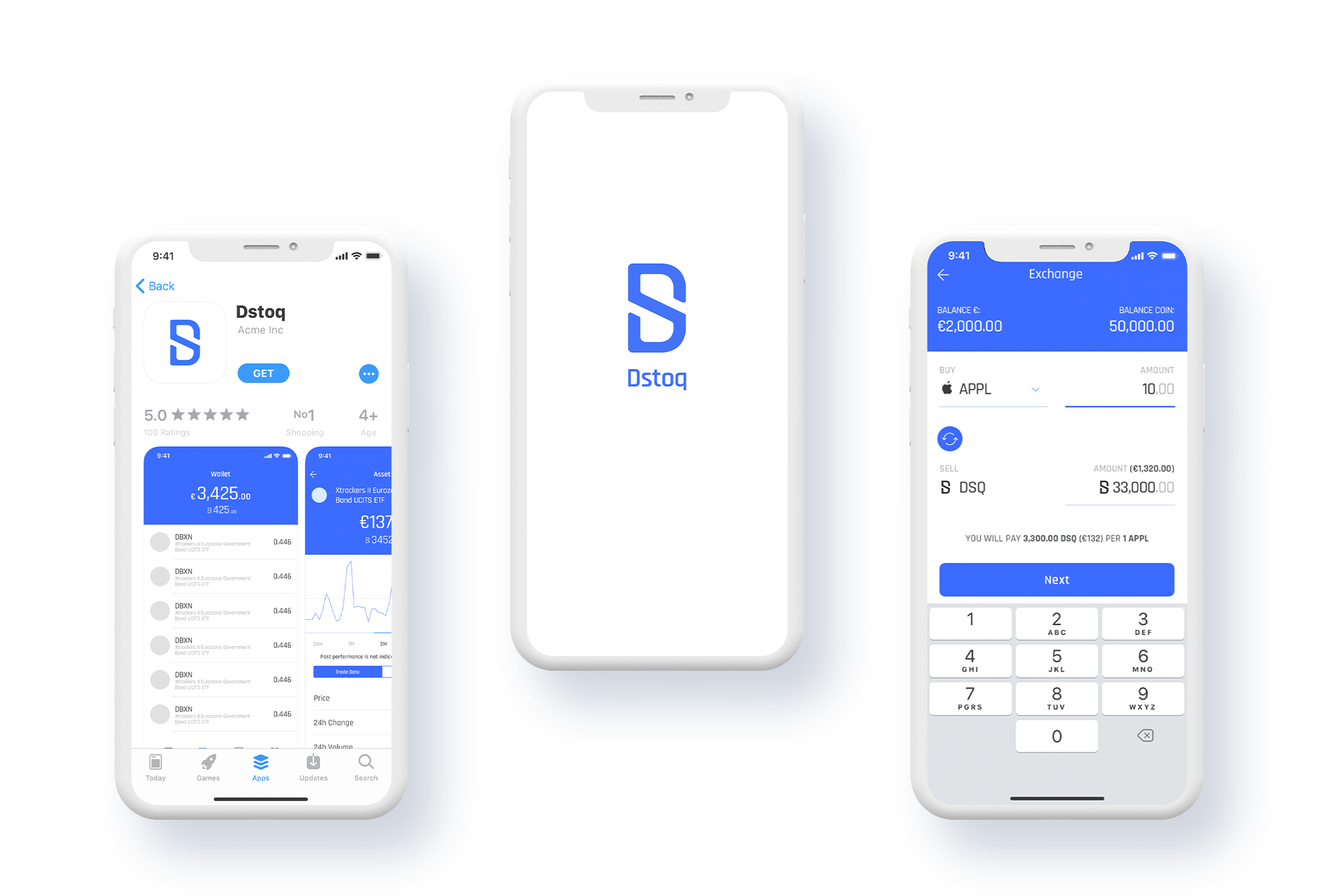
DSTOQ is a licensed stock exchange on a mission to introduce micro-investing to billions of people around the world. DSTOQ is an exchange without borders allowing for peer-to-peer trading of tokenized securities such as equities, bonds, stocks, oil and gold using the DSQ token.
As the only designer at DSTOQ, I was responsible for all design, talking to users and finding their pain points.
My role
The team was small but strong. I worked closely with a product manager and two developers, one building the iOS app and the other the Android app.
The team

Branding
Users mostly identified with the third solution. It made them feel trustworthy and modern as well as crypto-related.
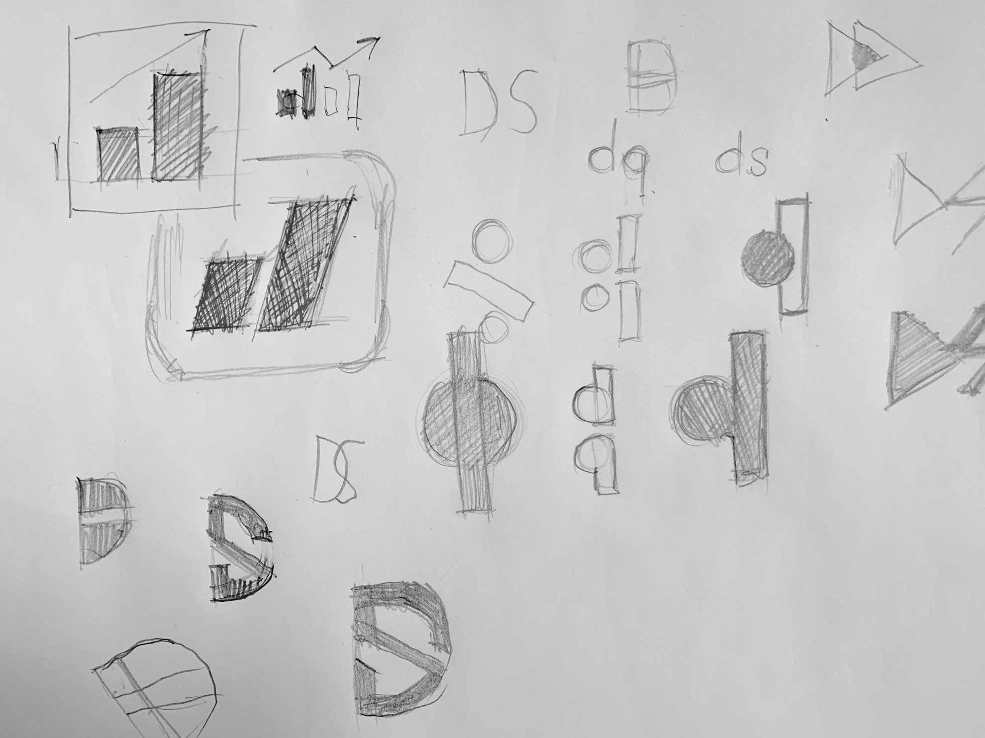
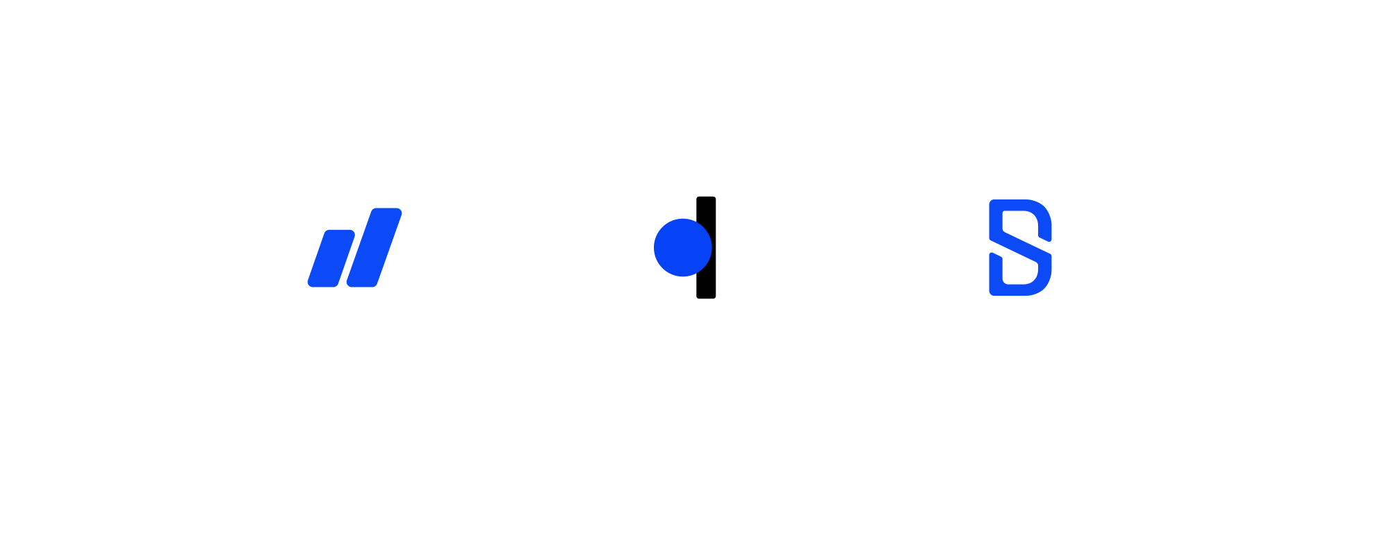
And the winner is…

Designing the website
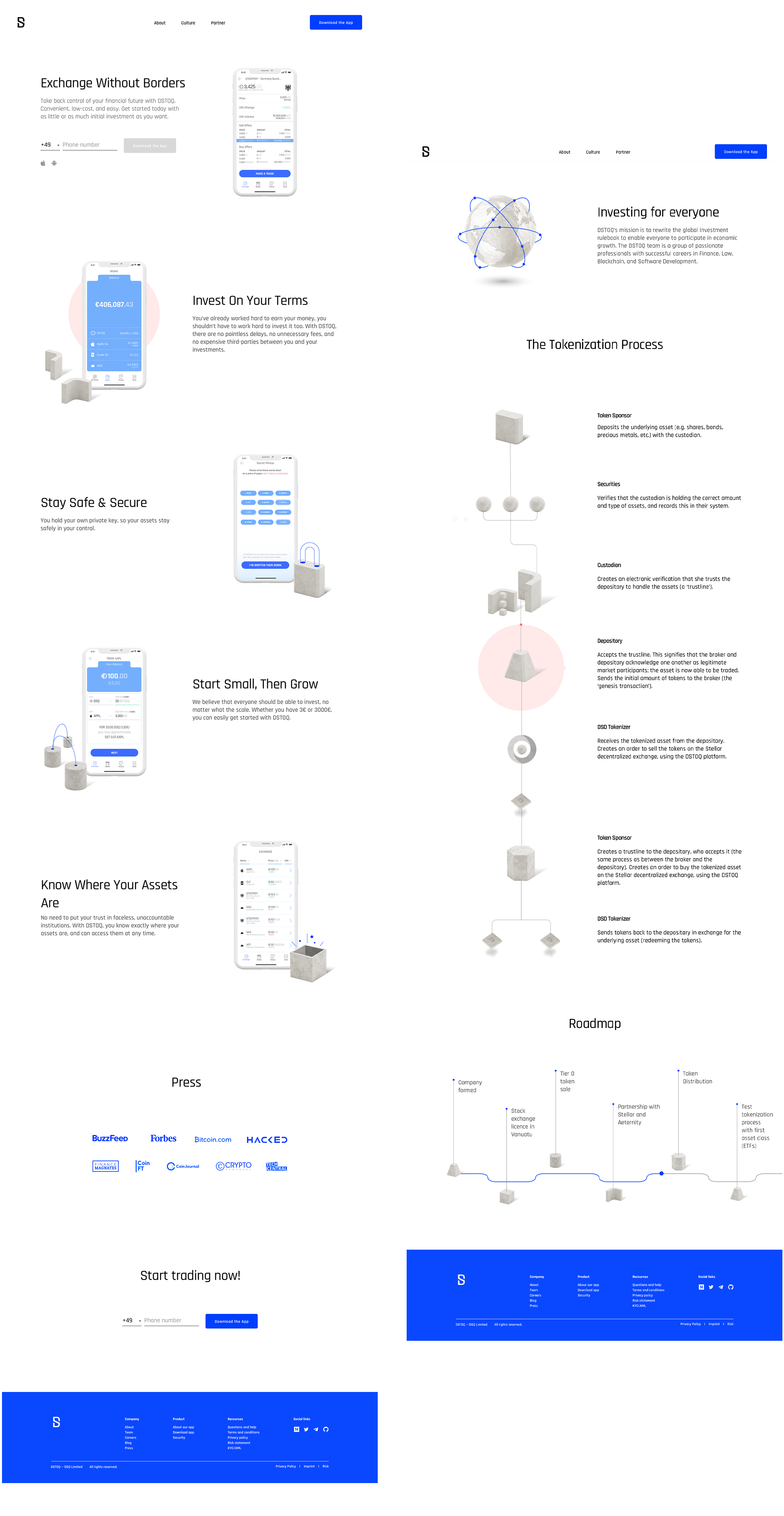
While designing the new website, the goal was to communicate application benefits in a simple and understandable way. Design-wise I followed the same principle: clean, modern and emphasizing CTAs.
Finding pain points
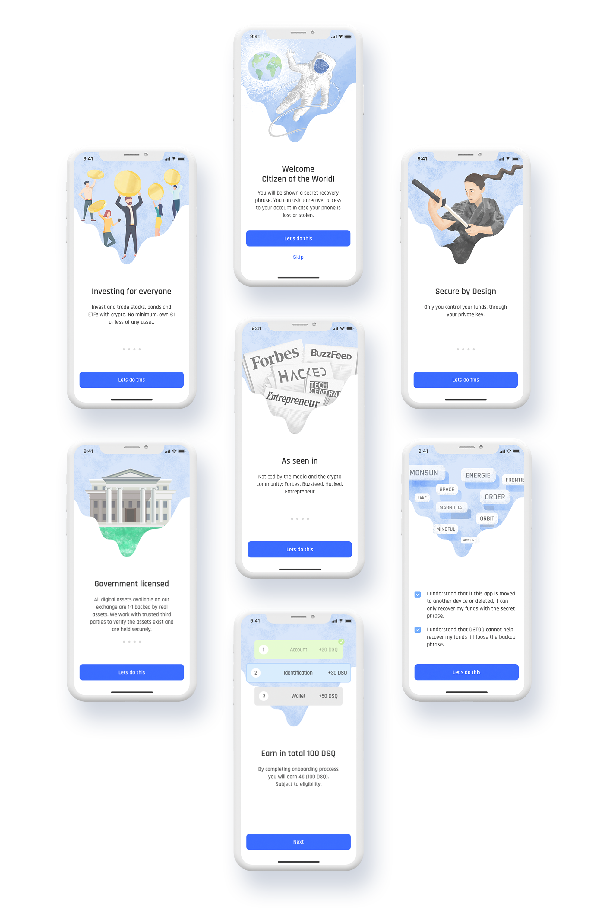
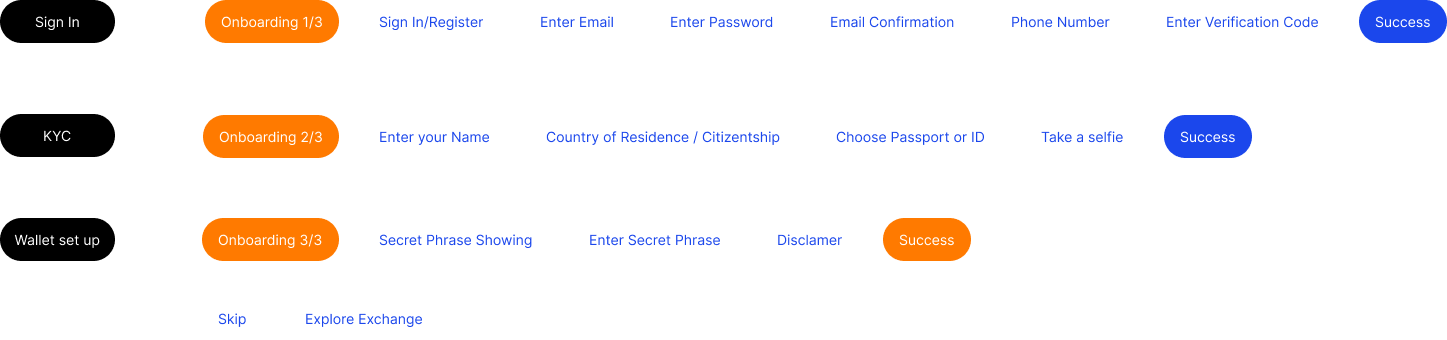
Because Dstoq is a financial application it has a more complex sign-in process that includes an identity check next to the usual steps. Keeping users engaged throughout the process is a very challenging task.
Research
After a few usability sessions of the first sign-in process some pain points were discovered:
The whole signing-in process was too long and boring.
Users didn’t understand the importance and value of following instructions regarding wallet security - secret phrase.


Solution
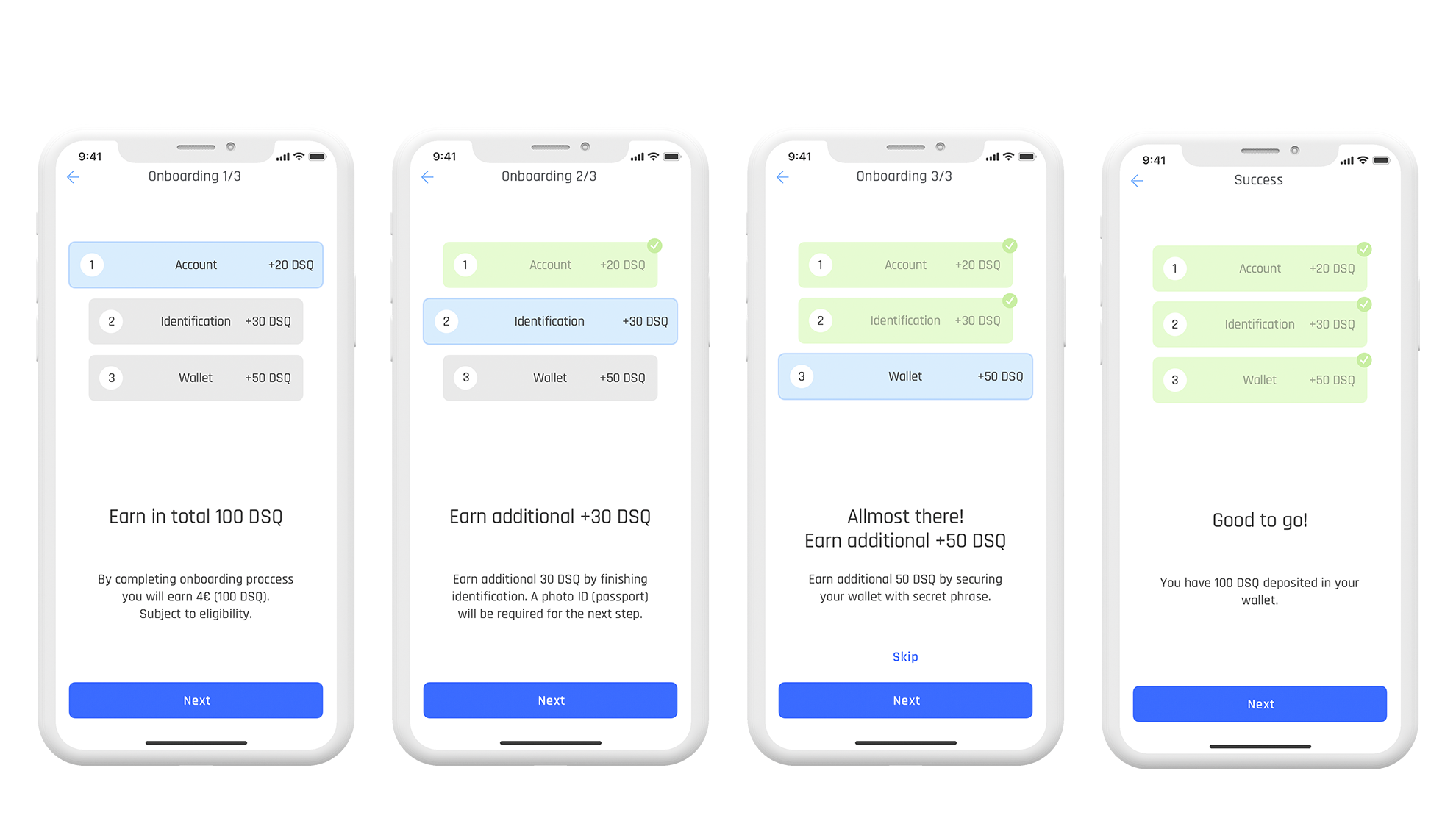
In the next iteration of the sign-in process, I changed the order of some steps and introduced a few new screens, gamifying the whole process.
Positive results
After introducing additional explanation screens, users had a better understanding of where they are in the sign-in process. Giving them tokens after every successfully finished step keeps them engaged throughout the whole flow.

Improving Trade flow
Problem
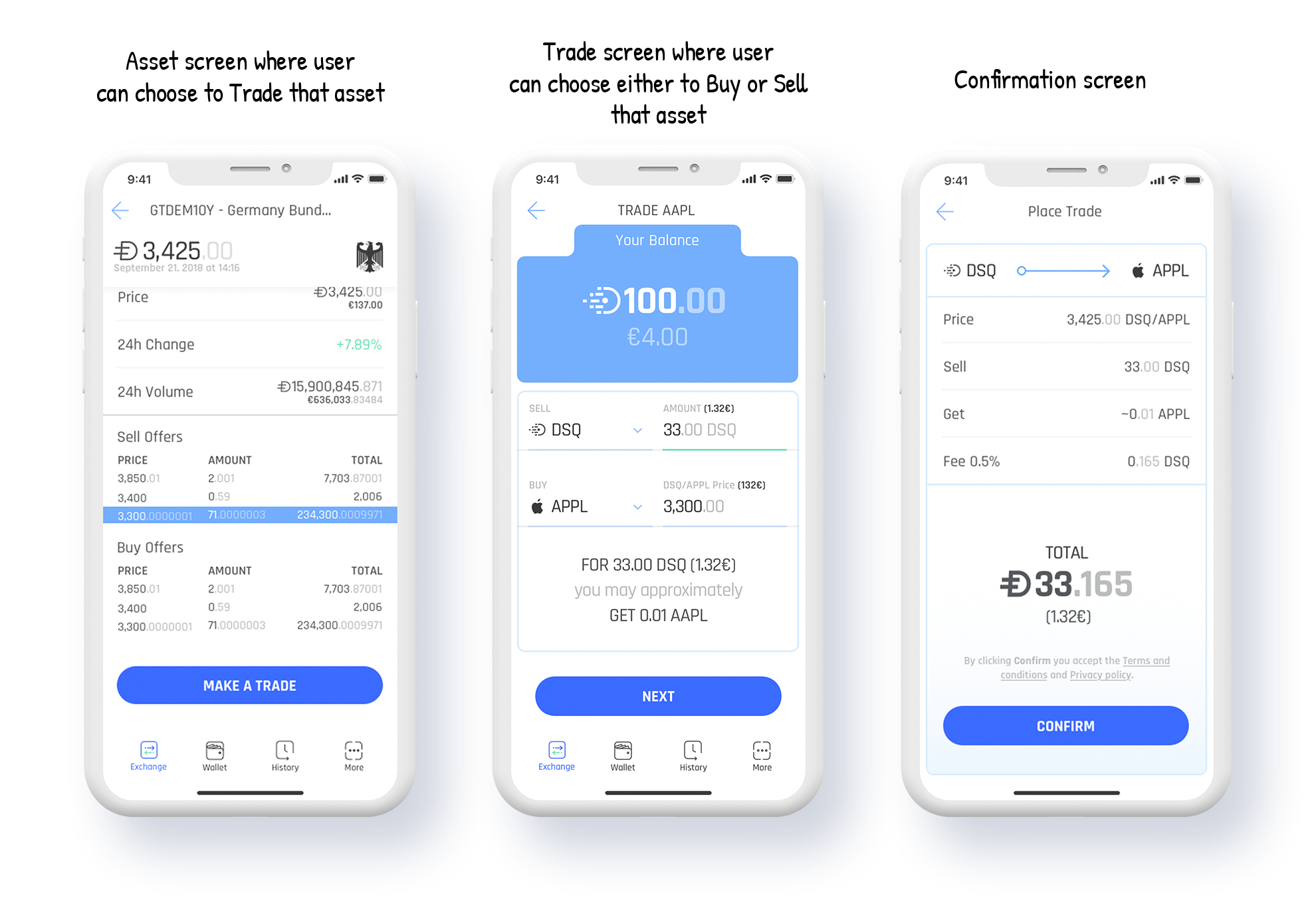
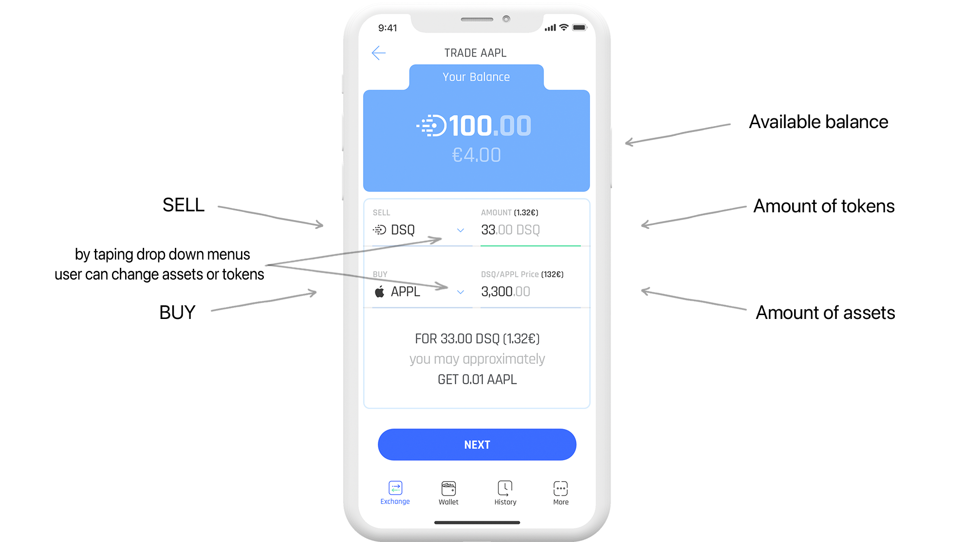
The first iteration of the trade screen allowed users to go back and forward with assets and DSQ tokens as well as to enter different values while the rest were calculated automatically. All of those options made users feel overwhelmed and confused.

Solution
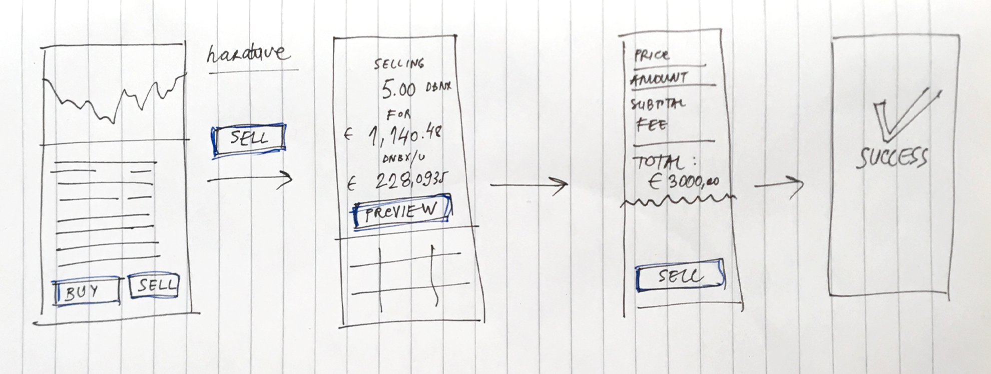
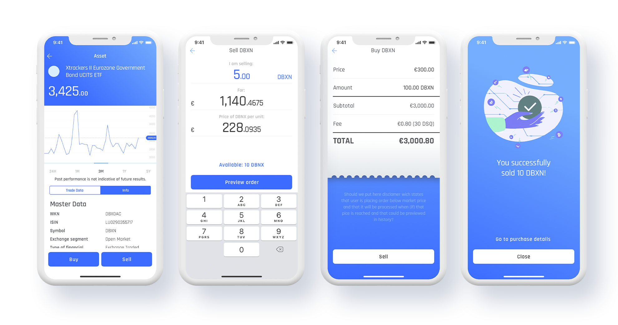
Since the user needs to make several decisions to complete a trade, I separated those decisions into a few steps.
I wanted it to sound like something that we would say in normal conversation, “I sold a pair of jeans for 50e”…
Shifting the decision to Buy or Sell assets from the trade screen one step back to the asset screen helped users focus on the values and amounts of the trade.
The trade screen got a major redesign, leaving only essential elements.
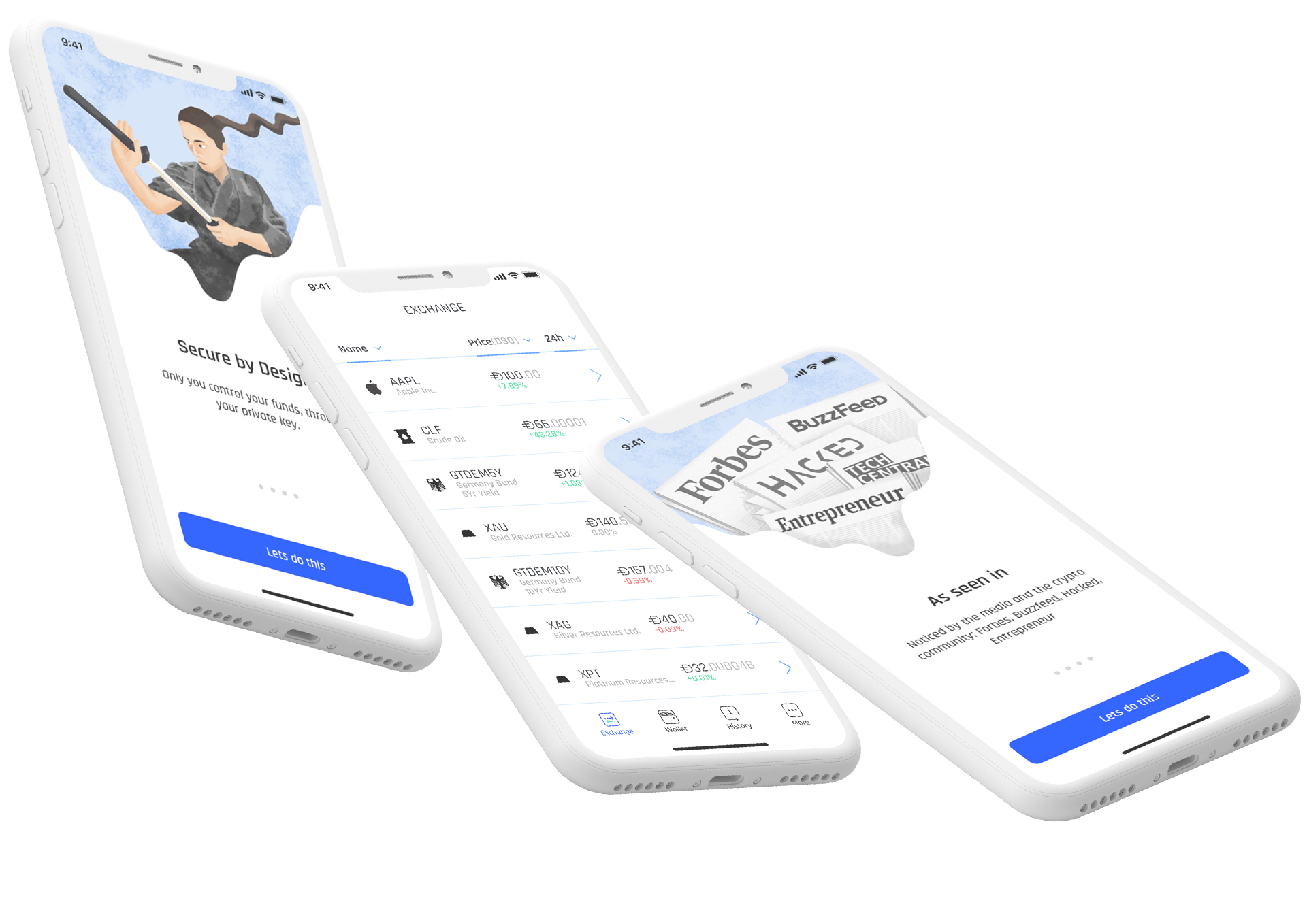
Illustrations
Besides presenting a message or instruction in a more stylish and fun way, illustrations create visual triggers that quickly transfer the necessary message.